Ray Kelly has to put in the order for the new club jersey design, but which is to be …. Retro or Modern?
So here is a unique chance to vote for your sartorial future. We have two alternative designs as previously posted on the blog.
Modern design
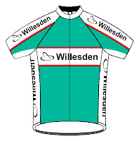
Retro Design
To submit your vote click on the voting panel on the right hand side of the blog (just under the Willesden Logo).
Ray has pointed out that the rigours of finalising the detail design will involve some changes to the final layout and colour of the jersey.
Voting closes on 5th October 2007
How about ‘Modern’ design but using the green from the ‘retro’.
Please don’t make Richard wear that retro design in races next year. he gets enough stick about his legs! The Modern Way! Blur
Blur? Don’t you mean the Kaiser Chiefs!!
If 2 people use the same computer it doesn’t allow each of them to have a vote! !!!!!!
Think anon. is confusing it with ‘Modern Life is Rubbish’ – Blur. However, the ‘modern’ jersey is quite nice.
I would like XL whatever design is selected following the rigorous democratic process. Today’s Modern is tomorrow’s retro, and so long as it comes up nicely in the wash I do not mind. Hmm must put the kettle on.
We had the best design ever 2/3/? jerseys ago Luckily it’s still used & instantly recognized by those who know what’s what