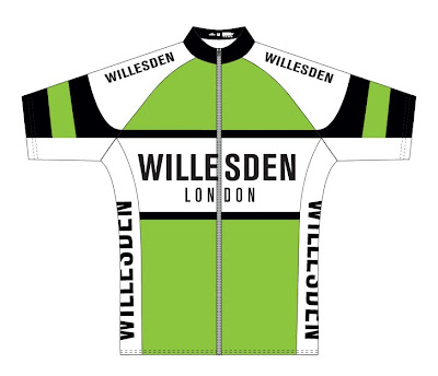
Richard Melik has been hard at work designing Willesden Jerseys too.
He has dropped the proposed logo in case we have difficulty in obtaining permission to use it. Richard is keen that London is used on the jersey so that the world knows where Willesden is. A good idea I think.
Cheers
Ray Kelly
Let Ray have your thoughts on the design either via the “comments” facility or through email on willesdencyclingclub@yahoo.co.uk
I am liking all the designs, but can’t we have a C.C. next to or a smaller ‘Cycling Club’ beneath the large ‘Willesden’?
Also, I have a Brixton Cycles jersey from a while back – it has their website address just above the hem on the back, along the bottom of the jersey pockets. We could have the (correct?) Willesden website address there, it wouldn’t clutter up the jersey (I like the uncluttered approach!).
I like the green more on this one đ
I agree with the inclusion of CC or cycling club.
Apart from that it looks good.
John W
Personally I liked the green more on the earlier version, it has a certain je ne sais Bianchi quoi. The first design also used more fluid lines. Either way, it would be good to include C.C and a web address.
Yet another John W; Club Captain.